TV Guide Product Refresh
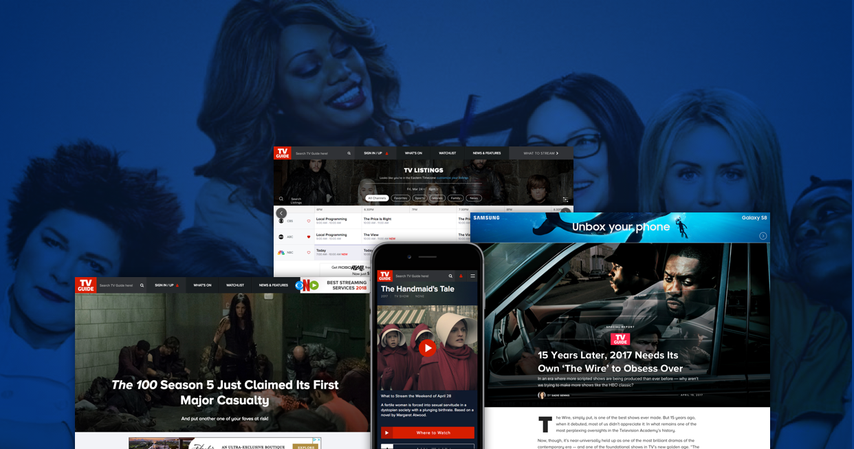
Create great experiences and they will stay. That was our mantra when we decided to take on the task of a refresh for TVGuide. More discovery, more delight = greater revenue
Goals: Increase user exploration, surface more viewable ads, expose video content.
Deeper, Richer Experience—23% increase in time per session
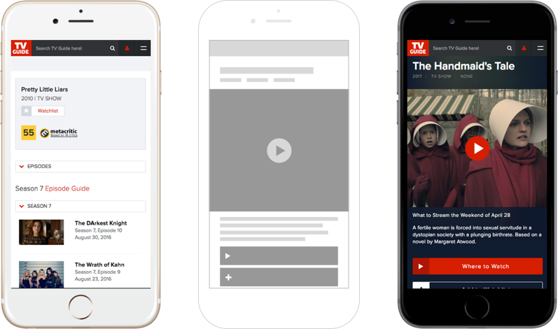
Before > Wireframe > Final Product
The previous mobile site provided information, but we were looking to create a more engaging experience. Promoting contextual video to the top of the page and dropping out noisy content, the new design surfaced 20% more ad units, and drove users to consume more unique video content.
Bolstered Discovery—15% increase in sections per visit
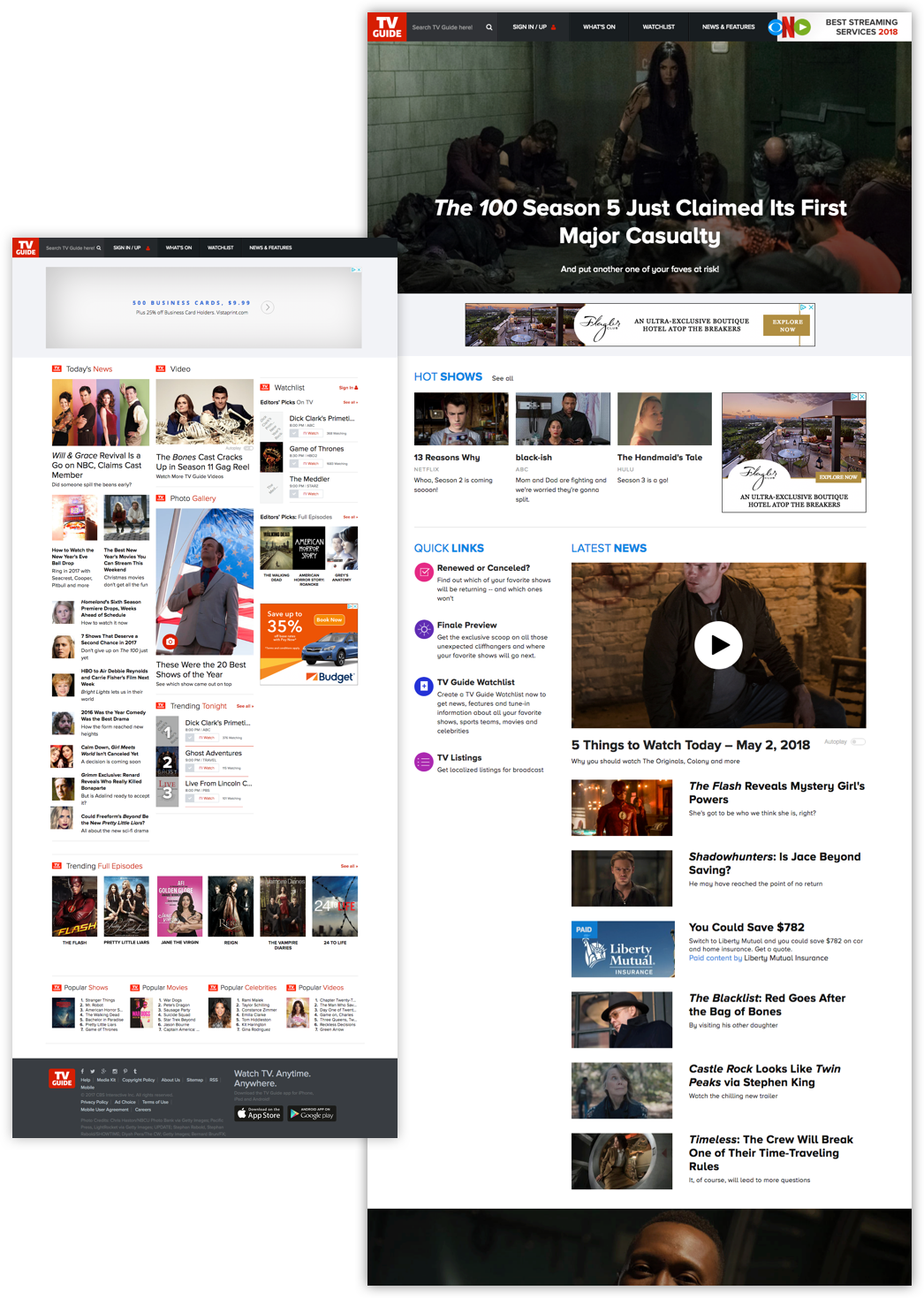
TVGuide has historically been a gateway to the listings section; one of the mandates of the new design was to expose users to new content offerings and other sections of the site.
The new Homepage became the launching point into many new sections. We de-nested as many of the elements as possible and revealed the beautiful imagery and content, taking full advantage of the screen real estate afforded to us on whatever device was being used.
More than just listings, rich editorial content
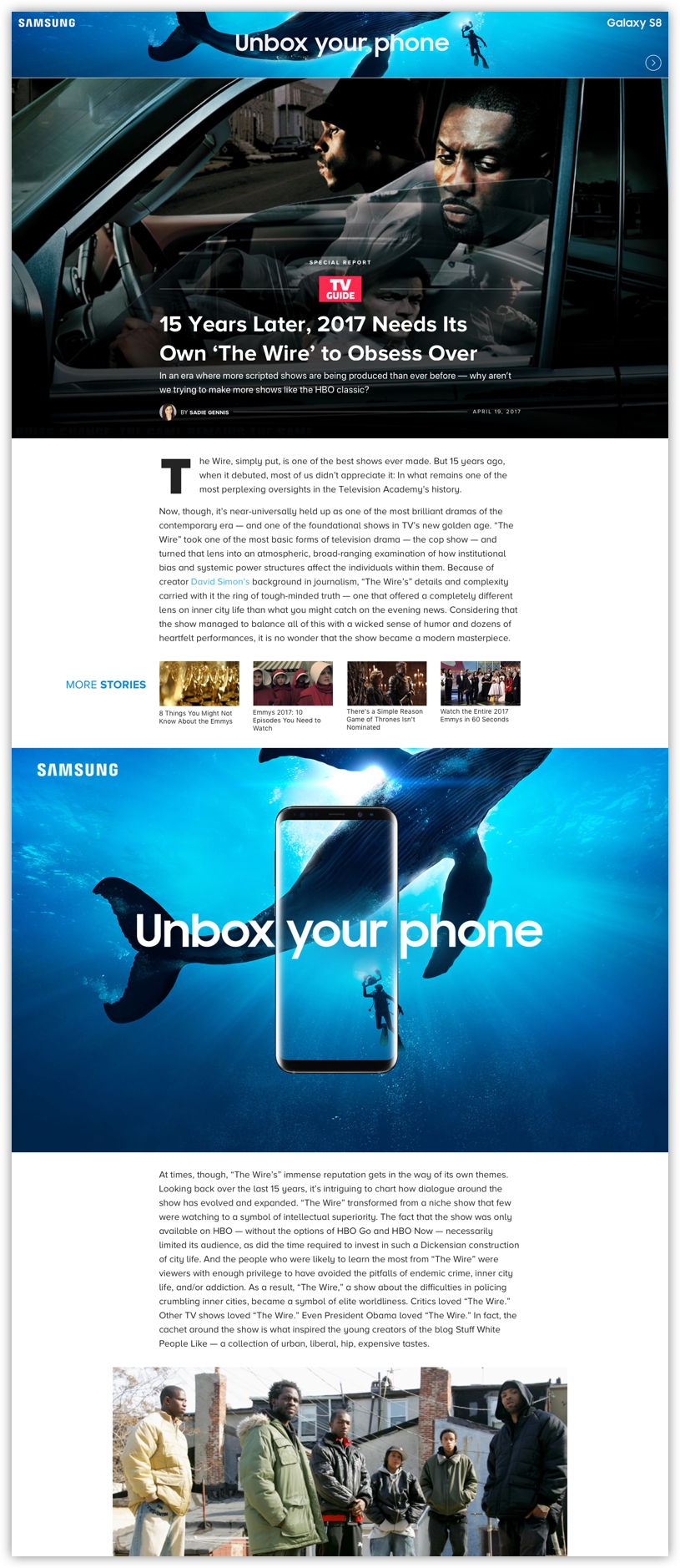
New sections, like the long form article page, allowed for users to discover additional content—videos, galleries, show pages and more—providing users with a deeper, richer experience to immerse themselves in.
Fix the Listings, it's ouR bread and butter
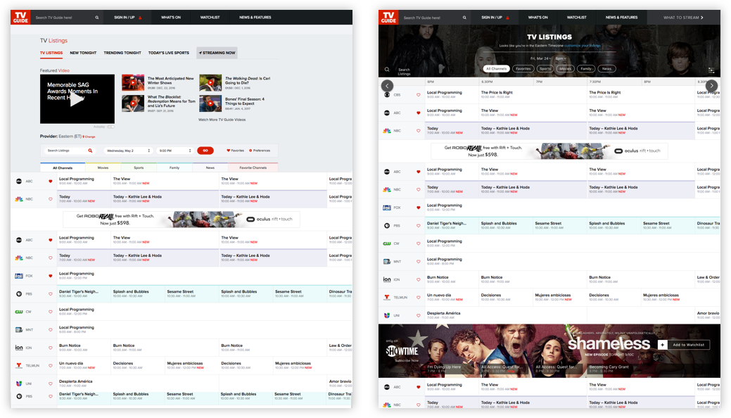
For the longest time the company had been resting on its laurels when it came to it's most popular section. People were still using it, why fix it if it 'ain't broke'. Layers of unnecessary information had been piled on of the years in an attempt to cash in on the popular section. We explored heat maps and analytics to back our argument. I decided to strip it down, creating a more usable section, and a better experience.
CD: Sushant Sund